IKI — ZenElegance
- Brand Identity
- Art Direction
- Packaging
- Digital

01 — Overview
IKI —
ZenElegance
IKI is a conceptual fashion brand built around the Japanese idea of iki: understated elegance, simplicity and conscious living.
The identity explores the balance between contemporary minimalism and a quieter, more tactile approach to fashion.
02 — The name
Understated
elegance.
The name comes from iki, a Japanese ideal of style that doesn’t announce itself — authentic, simple, without display. The identity is built to behave the same way.
03 — Principles
Three rules decide what stays — and what goes.
- 01
Minimalism
Visual simplicity and intentional design.
- 02
Consciousness
A considered approach to materials, production and consumption.
- 03
Timeless elegance
A visual language designed to exist beyond short-term trends.
04 — Logo system
Three letters. Nothing extra.
A narrow sans wordmark over a monospaced tagline. Two states — black on white, white on black — and the wordmark alone when space runs short.
05 — Typography
Cutive Mono
The monospaced typography introduces a subtle utilitarian and editorial contrast to IKI’s restrained visual language.
- Display
42 pt / −30 - Quiet form
- Body
14 pt / −30 - Every garment is chosen to be worn often and kept for years.
- Support
- SF Pro · Roboto
ABCDEFGHIJKLMNOPQRSTUVWXYZ
abcdefghijklmnopqrstuvwxyz
0123456789 — & / ( ) . , ;
06 — Colour & material
Black and white carry the brand. Colour is for cloth.
Jet Black
- HEX
- #000000
- CMYK
- 0 0 0 100
- PMS
- Black C
Pure White
- HEX
- #FFFFFF
- CMYK
- 0 0 0 0
- PMS
- Process White

Textile palette
Six muted tones reserved for fabric. They never appear in the logo — only in what people wear.
- Deep Gray#48555F
432 C - Slate Blue#4E5166
7541 C - Blue Gray#7C90A0
646 C - Ashen Beige#B5AA9D
7530 C - Stone Gray#B9B7A7
7534 C - Charcoal Gray#747274
430 C
07 — Art direction
Natural light. Neutral rooms. The garment first.
- Natural light
- Neutral environments
- Texture
- Restrained composition
- Product-focused


08 — Touchpoints
Small objects, same rules.
Business card, thank-you card, label and envelope — black, white and one typeface, so each piece reads as part of the same set.


Woven neck label — the wordmark alone, as the minimum-size rule asks.
09 — Packaging
Open here. Reuse me.


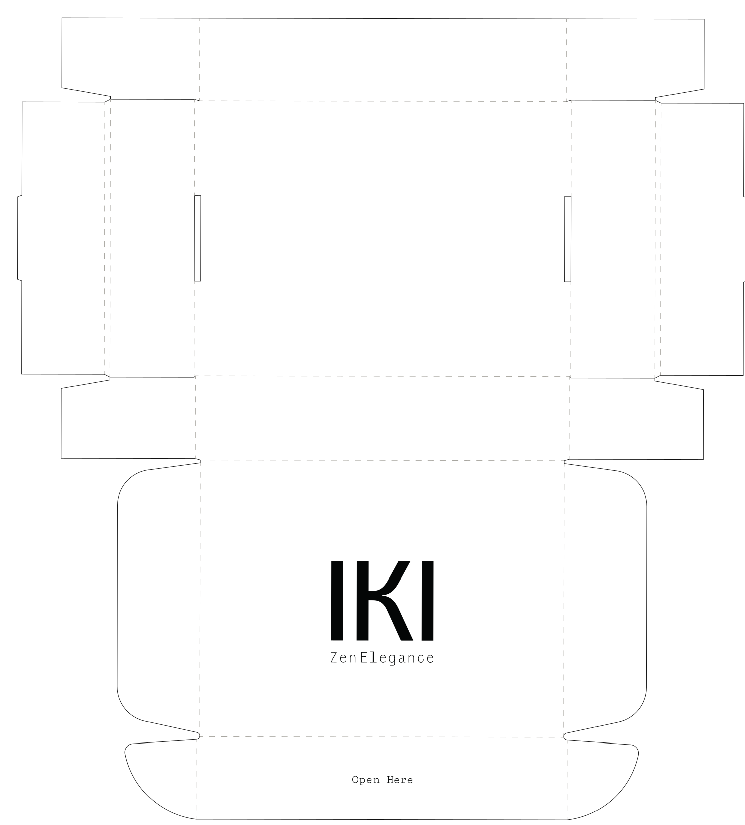
The box speaks twice. Outside, one instruction: open here. Inside, one request: reuse me. Everything else is the material.
- Material
- Kraft board — 340 g/m²
- Size
- 350 × 250 × 100 mm


10 — Campaign
Three lines. One voice.
A poster family on a shared grid: logo top-left, line bottom, the same rule and folio. Background and crop change; the system doesn’t.

Less,
but better.
Quietly
distinct.
Zen
elegance.

11 — Out of home
Flat first, then the street.


One figure, one logo, one QR. The frame lines come from the print ad, so the street and the magazine share a layout.
- Format
- MUPI, 1200 × 1750 mm
- Stock
- 150 g/m²

12 — Editorial
IKI — Collection 01
A lookbook study: cover and two spreads, set in the brand’s monospace with generous margins and a single image per idea.
Quiet
form.

Form /
Texture /
Silence
At IKI, the photograph puts the garment at the centre: a light background, natural light, nothing that competes with the cloth.
Textures and details carry the story. Each image aims for the same thing as the clothes — simplicity that lasts longer than a season.
Less,
better.


13 — Digital
The shop, in the same voice.
Oversized wordmark, a single rail of garments and monospaced controls. The e-commerce borrows the print grid instead of a template.

- Home
- Wordmark at full height, one rail of garments
- Collection
- Black monospaced filters, three-up grid
- Product
- Neutral backdrop, garment centred
Nothing on the page is decoration: the logo does the branding, the clothes do the rest. On mobile the rail becomes the hero and the grid drops to two columns.
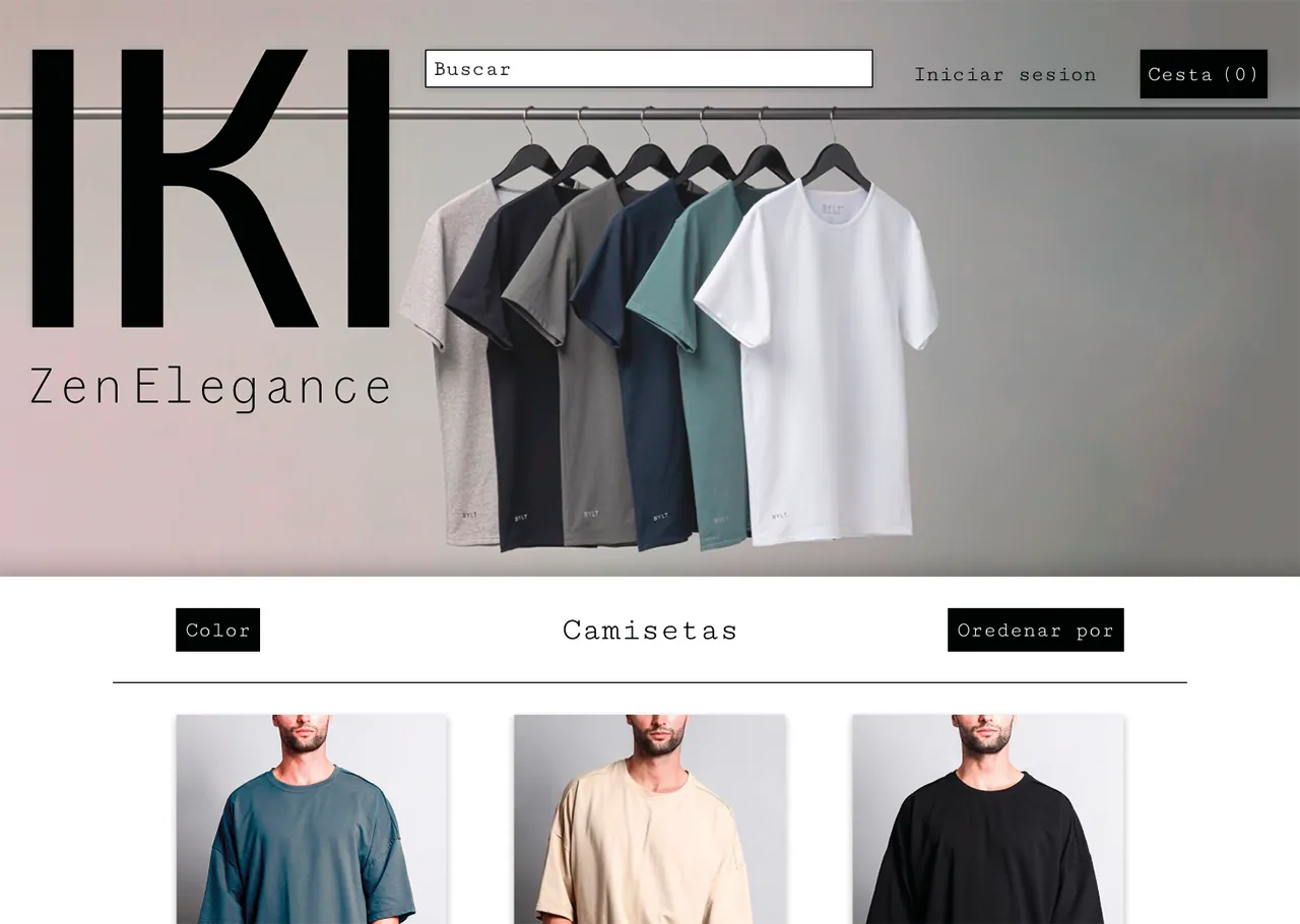
Tablet — the same home in context.

14 — Social
A feed that reads like a lookbook.
Image, product, type, repeat. Posts alternate so the grid never turns into a catalogue.
Less,
but
better.
Calm /
Balance /
Everyday
Essential
On the phone, the profile grid keeps the same rhythm: one image, one product, one line of type.


