Case 02 · Product redesign · iOS
Coach
Training and nutrition for weeks that rarely go to plan.
- Role
- Product design, solo
- Timeline
- 2024 project · 2026 redesign
- Platform
- iOS
- Tools
- Figma
01The problem
Too much product, not enough focus
In 2024 Coach tried to cover training, nutrition, progress, social features and community at once. For the 2026 redesign I cut it back to what people asked about in the research, and gave every screen one job.
Scope, 2024 → 2026
Training Nutrition Social Progress Community
- Today
What should I do today?
Research: clear routines and guidance. - Nutrition
How am I doing today?
Research: simple daily tracking. - Progress
How is my week going?
Research: visible signs of improvement.
| Area | 2024 | 2026 |
|---|---|---|
| Home | Calorie summary first | Next workout first |
| Navigation | Five tabs | Three tabs |
| Session length | Fixed estimate | 20, 32 or 45 min |
| Food logging | Full nutrition table | Quantity and macros |
| Colour | Neon yellow and pink | Yellow only for action |

02The product
A week with Coach, one screen at a time.


-
Onboarding
Four answers, then a plan.
Experience, goal, available days and where the user trains. Connecting Apple Health is optional. The first week comes from those answers and keeps changing with the user's schedule and feedback.
-
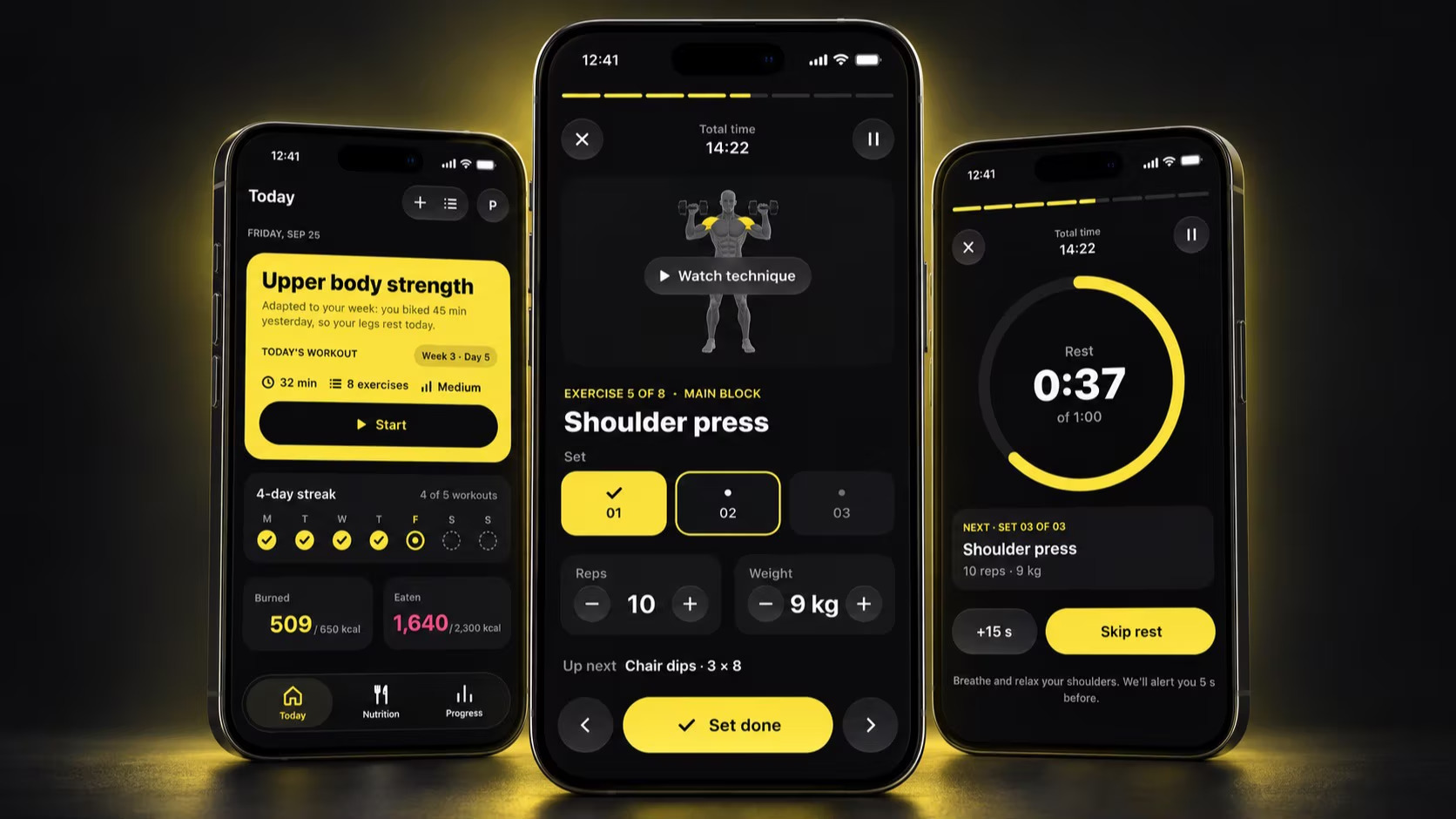
Today
One clear answer: what should I do today?
The 2024 home opened on calories. In 2026 it opens on the next workout and the reason Coach chose it.
- Next workout firstLength, exercises and intensity, with Start one tap away.
- The reason in one lineA plan that changes on its own needs to say why.
- Streak against the weekFour of five planned workouts done.
- Burned and eaten side by sideTraining and food on one screen; detail lives in each tab.
- Three tabsToday, Nutrition and Progress. The 2024 version had five.
-
Before starting
The session fits the time available.
A 45-minute plan is useless when the user only has 20. The session shortens or stretches without losing its focus.
203245min
-
During a set
Less interface when attention matters most.
Set, reps, weight and what comes next, with large controls and Set done as the main action.
-
Between sets
Rest is part of the plan.
A one-minute timer, the next set already loaded and +15 s for when the last set was harder than planned.
-
After
The plan learns from the session.
A rating from 1 to 5 shapes the next workout. Stopping early saves what was done and rebalances the rest of the week.
-
Nutrition
Nutrition without a calorie database.
Calories, macros and meals for today. Goals follow the plan, with more calories and carbs on training days.
In-app message · upper body dayYou're 42 g short on protein. A salmon or chicken dinner covers it.
-
Food logging
Fewer decisions to add a meal.
The 2024 usability test flagged food logging. Recent foods now sit above the search field, and amount, macros and meal fit on one screen, with today's protein updated before adding.
-
Progress
A weekly view of effort and consistency.
Calories burned lead the week. Workouts, active time, daily average and streak add the context.
032024 → 2026
Before and after.
Drag the handle to compare the 2024 home with the 2026 Today screen. The calorie summary, the neon pink and the five tabs are gone.
2024 Original academic project
2026 Product redesign

04Design system
Built for focus.
A restrained dark palette, with yellow reserved for action, selection and progress. Nutrition adds colour only where it separates metrics.
Colour
- bg/base#0A0A0B
- bg/elevated#17171A
- accent#F5E14B
- energy#FF5C85
- macro/protein#5AC8FA
- macro/carbs#FFB340
- macro/fat#BF5AF2
Type
SF Pro · 18 text styles
Radius
12 · 18 · 22 · 28 · full
Spacing
4–40
pt, in 8 steps
Library
18
components · 25 icons

05What's next
What I'd test next.
The 2026 redesign hasn't been tested with users yet. The food logging changes come from the 2024 usability test; the rest comes from the original research and my own calls. These are the first things I'd put in front of people.
Does the reason line on Today make an automatic plan feel trustworthy, or do people still want to pick the session themselves?
Are 20, 32 and 45 minutes the right lengths, or should users set their own?
How long does it take to log a dinner in 2026 compared with the 2024 flow?
Playground →
